The Anatomy of Minimalist Packaging: Designing for Tactile Memory
In an era dominated by hyper-saturated digital feeds, the physical unboxing experience is one of the few authentic sanctuaries where a brand can whisper rather than scream.

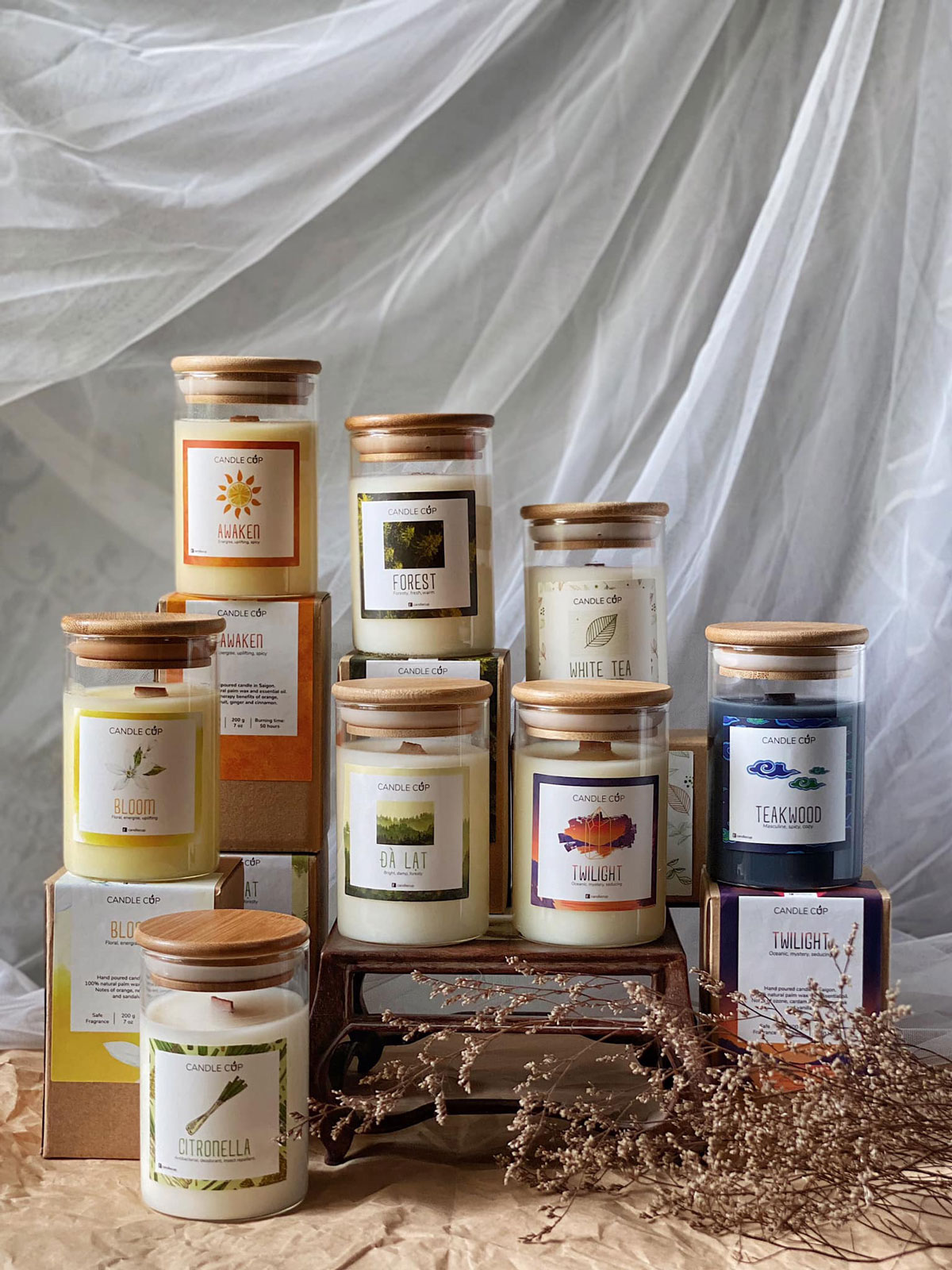
When a customer receives a package, their first interaction is not cognitive—it is haptic. Before the eyes have fully parsed the typographic scale or the subtle tint of a label, their fingertips have registered the texture of the cardstock, the crispness of the fold, and the satisfying resistance of a debossed logo.
In premium product strategy, touch establishes subconscious trust far faster than visual ornamentation ever could. The weight of the material in hand speaks immediately of intention, durability, and respect for the customer’s choice.
“Minimalism is not the lack of something. It is simply the perfect amount of everything.”— Nicholas Burroughs • Design Philosophy
01 / The Fallacy of Emptiness
Many novice designers confuse minimalism with laziness: slap a generic sans-serif font in the center of an empty white box and call it luxury. But authentic restraint is extraordinarily demanding. When you eliminate decorative illustrations, loud bursts of primary color, and promotional badges, whatever elements remain on the surface are under intense magnification.
A 0.5pt variance in letter-spacing, an inconsistent margin, or an inferior paper grade cannot hide behind complex graphics. In minimalist packaging, the craft is the concept.
During tactile prototyping, always evaluate cardstock swatches under both 2700K warm incandescent retail lighting and 5000K daylight. Paper grain direction drastically alters shadow casting on debossed letterforms.
02 / Paper as an Emotional Anchor
During our design process for artisanal clients such as CandleCup, over 40% of the exploratory phase was dedicated strictly to paper swatches and printing technique trials. We tested uncoated cotton stocks against recycled eucalyptus fibers, experimenting with how soy-based ink absorbed into different grains.
When a package feels grounding and organic to the touch, it instinctively justifies a premium price point in the consumer’s subconscious long before they inspect the price tag.
03 / Typographic Pacing and Ritual
Packaging should unravel like a quiet piece of music. As the exterior seal is broken, what is the first phrase revealed? As the interior lid lifts, what note welcomes the patron?
By pacing information—relegating regulatory and barcode details strictly to the base and reserving the front face exclusively for product name, origin, and batch identification—the product ceases to be a commercial commodity and transforms into a personal ritual.
04 / Restraint as Competitive Advantage
In crowded retail aisles where every competitor attempts to be 10% louder, the brand that possesses the confidence to remain quiet is invariably the one that commands attention. In design, silence is not the absence of sound; it is the space where meaning resonates.