CandleCup — Artisanal Aroma System
A sensory unboxing ritual and tactile visual identity engineered for botanical scented candles, bridging apothecary traditions with modern minimalist luxury.
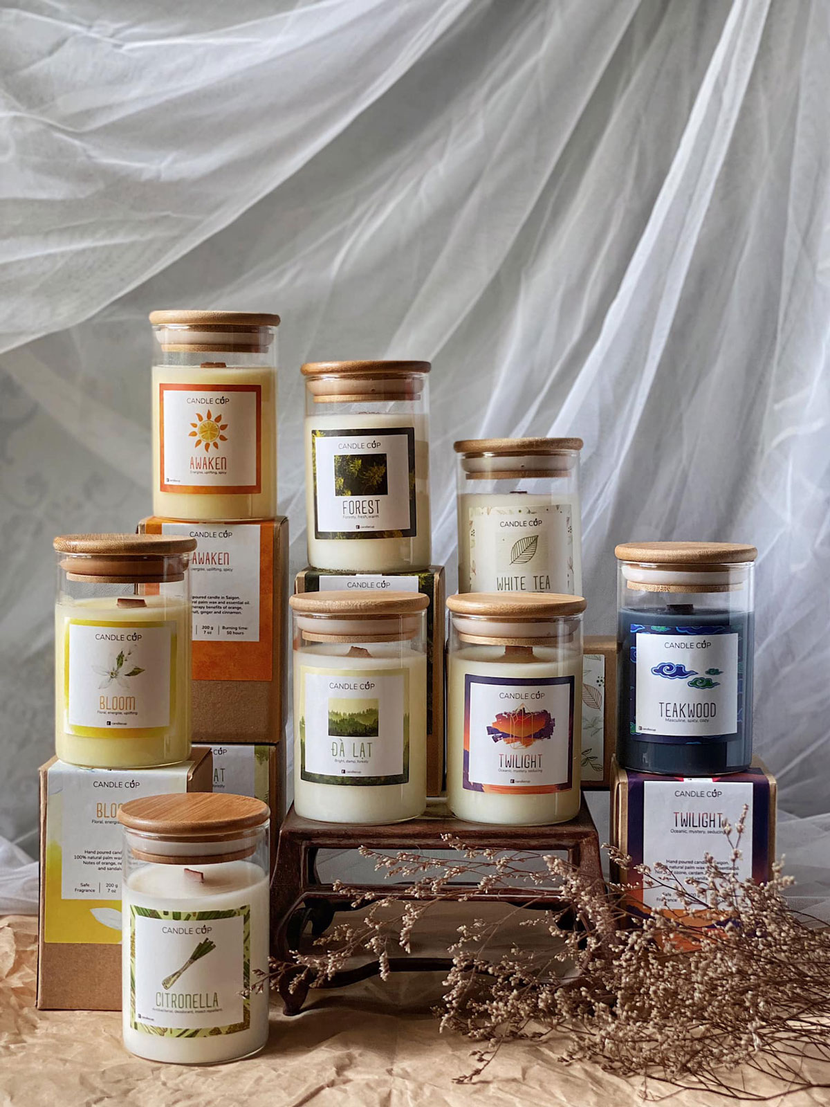
CandleCup had established an enthusiastic local clientele who adored their handmade, small-batch botanical candles. However, across retail boutiques and high-end lifestyle concept stores in Saigon and Hanoi, their initial packaging blended into the noisy backdrop of mass-market imports. Label architecture suffered from fragmented hierarchy, while disparate colors and cluttered graphics diluted the brand’s authentic artisanal integrity.
Our objective was to strip away ornamental distractions and engineer a restrained, sensory packaging ecosystem that whispers rather than screams. The packaging needed to transform an everyday candle purchase into a quiet, grounding personal ritual.
Inspired by classical apothecary archives and Japanese botanical herbarium classifications, we designed a disciplined typographical grid. Each piece of information was assigned an intentional architectural position: Fragrance Name, Botanical Notes, Net Weight, Estimated Burning Duration, and Artisan Batch Sequence.
By restricting typography to a rigorous sans-serif paired with Agdasima-inspired technical numerals, the system accommodates over 12 seasonal aromas without altering the core visual grammar.
“When a package feels grounding and organic to the touch, it instinctively justifies a premium price point in the consumer’s subconscious long before they strike a match.”— Đinh Toàn Trung (Zed), Creative Director
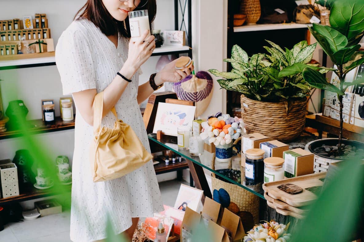
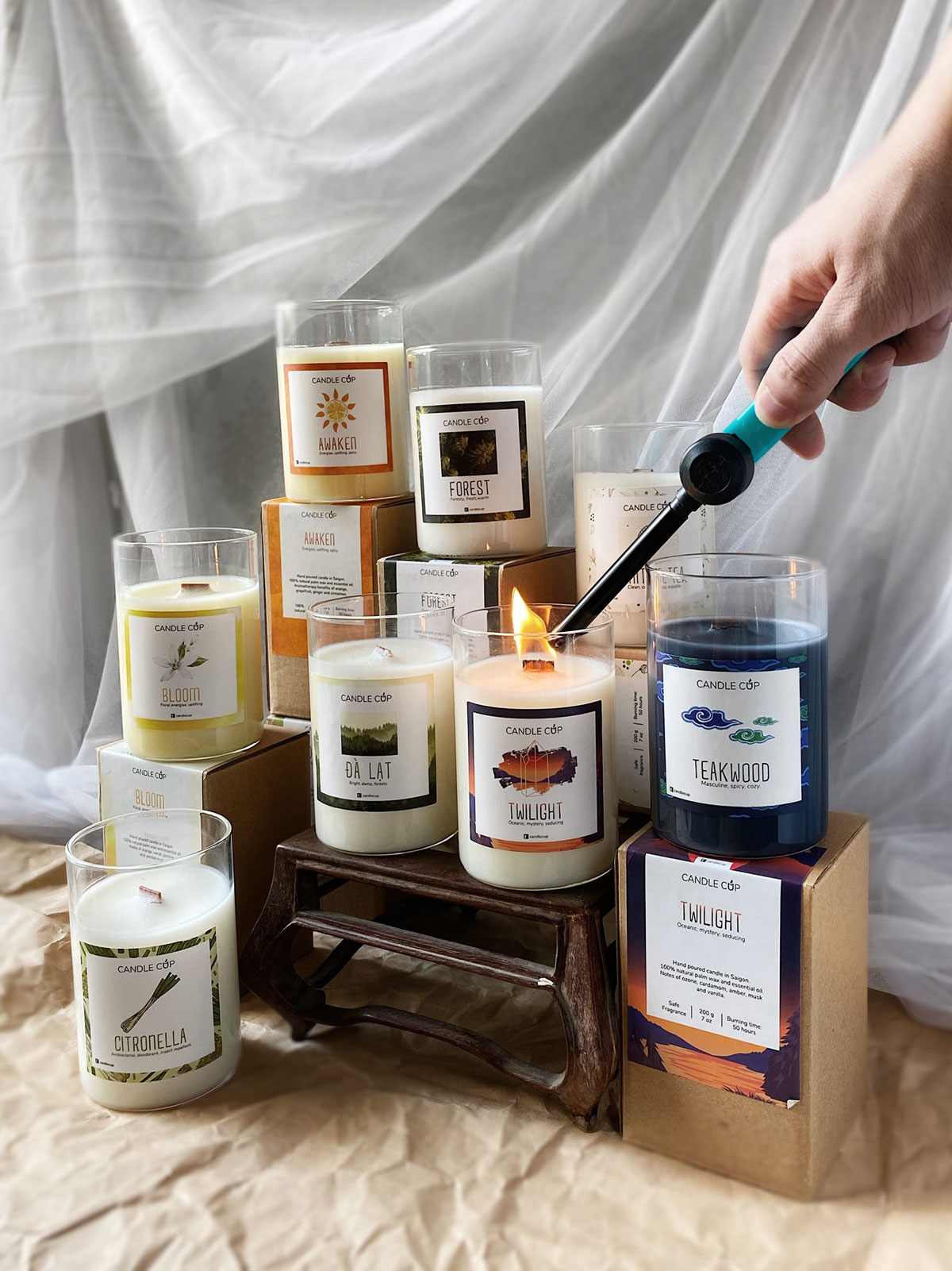
Over 40% of the exploratory phase was dedicated to physical substrate trials. We selected 320gsm G.F Smith uncoated cotton stock for the primary labels—allowing the paper’s raw, fibrous tooth to contrast against the slick dark amber apothecary glass.
All typography is pressed using biodegradable soy inks with high-precision Heidelberg letterpress debossing, creating subtle shadow lines that fingers discover before eyes finish reading.
Results • Performance • Growth

Grab Vietnam Promotional KV
Fintech activation campaigns, retail merchant POSM, and high-velocity digital promotions.
CandleCup Artisanal Aroma
Complete brand identity framework, artisanal label packaging, and tactile sensory touchpoints.

Bia Saigon Special Festive
National festive campaign key visual, premium packaging wrap, and dynamic kinetic retail POSM.

The Pizza Company Menu & POSM
Editorial dine-in menu architecture, food photography art direction, and spatial signage.
Ready to elevate your brand or packaging?
We partner with ambitious founders, brand leaders, and design teams to engineer distinctive identity systems and tactile packaging that drive lasting business growth.